I attracted my audience by using bright colours on my front cover and also big, bold writing making the masthead and headline stand out to grab the readers’ attention. I used photos that looked directly at the camera so that there was eye contact in order to catch the readers’ attention with minimal effort. My strap also used bright colours to attract readers and this also fits in with the colours that my audience would be related with. I did the same with my contents page making it stand out and keeping it to a colour style. For my contents page I used red, black and white. With my double page spread I did an interview with the main band member from ‘Flamethrower’ and for this I addressed the audience by talking to them directly and using quite chatty language. Insted of using words like concerts and shows, I have decided to use gigs which my audience will know what it means and it adds to the informality of my piece. Here is front cover that I have used 'Flickr' to annotate and show how I addressed my audience.
My magazine is aimed a emos, goths and Indie scenesters. I have tried to create a relationship between all of my target audience and my magazine. I first thought of what my target audience were into, and I came up with bright colours and black. With this in mind I placed 3 images on the bottom of my front cover and increased the contrast to make the colours bright. After completing my front cover I turned my attention to my double page spread. I needed a name for my main band and something that could be related to my target audience. I know that some of my target audience smoke and also like things to be a bit 'hardcore' so I thought of something like that and came up with 'Flamethrower.' This enabled me to do a lot of things with my double page spread because I could base it on flames, or the colour of flames or actually have flames, so I decided to do all 3. I used flames on the name, the colour of flames on the writing and abstract flames on the wall behind the main band.
After thinking of what colours I wanted my double page spread to be, I had to think of the article itself. I wanted it to be formal but at the same time not so formal, so I decided on doing an interview and laid it out quite formally but the content I kept the same as though it was being said. I wanted it to be jokey so I added a few minor punch lines into the interview and finally I wanted my article to reflect my target audience, so I tried to write it like a normal interview but adding little lines that give it a sense of teenage thoughts.
Sunday, 28 February 2010


Saturday, 27 February 2010
What have you learnt about the technologies from the process of constructing this product
From this project I have learnt more about using Photoshop and the effects that it has. From the screenshot below you can see how my magazines differ. My college magazine on the left doesn't have a main headline and therefore looks more of a book than it does a magazine. I have used the high contrast on both magazines because I think that it has a good effect and it suits my audience for both magazines. The font I have used for my music magazine suits the type of magazine that it is whereas for my college magazine it doesn't as much but on the other hand it has a formal look and when exams are taken then it is very formal. You can see from the image below that both magazines have a colour scheme, for my college magazine it is; blue, orange and yellow and for my music magazine it is; red, black and yellow. These are suited very well because the college colours are blue and orange and I have maintained the colour scheme throughout my music magazine. Both my magazines are suited for my audience because if my college magazine was selling studded belts and my music magazine was selling college folders then they would not be. My music magazine is more suited to my audience because the expressions on the faces and the direct eye contact adds to the aggressiveness that my target audience are stereotypically associated with. Whereas my college magazine is just shots around college, no focus hasd been put into the images. However, For my main projects I thought about what, where and how I wanted my photos and what I wanted them to look like, how I wanted them to represent something, so I thought deeply about my photos and tried to get the right images.

One image on my front cover is of my friend Ashley who is looking down on the camera. Here I found a picture of James Bond in the same style of pose looking down at the camera and having no expression on his face. The camera angle on both of the images is low and they are both medium close ups with Bond having a little bit more showing so possibly being a medium long shot.

Ashley's posture is upright and hands behind his back looking directly into the camera. Bond's posture is also upright and looking directly into the camera. The only difference with this shot is that Bond's hands are in his pockets giving a more sleek and causal look which is the sort of character he is.
The clothes they are both wearing are not 100% different but they are not the same. I think that the way they both have their jackets open at the neck revealing the top of the t-shirt/shirt makes them both look casual and gives them a sense of purpose.
Both Ashley and Bond have a plain white background which suggests that they could have been Photoshopped or taken in a studio. Either way, the lighting for both of the photos is high profile and shows that they are both important. The lighting emphasises the face and the blackness of the clothes that they are both wearing. It also makes them stand out more and makes them more visable to the audience eventhough there is only one person in each shot.
Both Ashley and Bond have a plain white background which suggests that they could have been Photoshopped or taken in a studio. Either way, the lighting for both of the photos is high profile and shows that they are both important. The lighting emphasises the face and the blackness of the clothes that they are both wearing. It also makes them stand out more and makes them more visable to the audience eventhough there is only one person in each shot.


Friday, 26 February 2010
In what ways does your media product use, develop or challenge forms and conventions of real media products?

He is an collage that I made on Photoshop. It includes 8 comparisons from my magazine and existing magazines. I have used 'Flickr' to annotate and compare these sections.

Thursday, 25 February 2010
 This is the logo of the blogging site I used to
 create my portfolio. I used blogger because it was easy to use. Although before starting media AS I had never used or created a blog before, after a short demonstration I found it easy to use and thought that it has been very productive. With this I found it very easy just to type and post. It is very easy to arrange different things on my blog for example, images next to text and the colour scheme of my blog.
I used 'Flickr' to annotate some of my images including the front covers of existing magazines and a double page spread. Again I had never used this before but found it easy to use and got the hang of it after finding out what things did. With this I felt that the application was very easy to use, it enabled me to annotate my pictures and say what I wanted to but on the other hand I could only enter a certain amount of text and the boxes were only 90 degree rectangles. I feel that this needs to be improved so that any shape can be used to annotate the images as some of the image may be cut off and other images in correspondence to it may mean that when you drag your cursor over one part, another part may also be highlighted and therefore giving you the wrong information about the highlighted part.
 For my target audience research, I decided to use 'Microsoft Excel' to present the results from the questionnaire as graphs. This is because I find it easy to use and although it took a little bit more time than what online graph makers do, an advantage is that you have the data for the graphs ready to use again whereas if using a graph creator then you have to input the data when you make the graph. This means that if a graph is made and it isn't right or one of the data points is wrong then you have to start over again from the start. A graph creator only allows you to create the graph and customise it to what you want. 'Excel' allows you to create the graph, customise it, add additional things such as data labels and other things that a online graph maker doesn't. I prefer 'Excel' to a graph creator because I was able to create my graphs when I wasn't at college on my laptop. Whereas if I had used an online graph creator and I did not have internet on my laptop, then I would be unable to create my graphs and this would put me behind.
One technique I have become better in using and more confident in using is layers. I now find layering very easy and the effects from using it can be quite significant. Whereas before, I used to use as fewer layers as possible. Here is a screenshot of Photoshop and how I have used layers in my double page spread. I also enjoy being able to create a better effect by using Photoshop's protential. I find that using a drop shadow makes any photo stand out from the background it is set on, as long as the colour is contasting to that of the background. I also like using the rotaion of images/text to give a more human touch which adds to the effect of it being created from scratch.


Above is an essay that I have written for English against the new post box for blogging. On the right we can see that for explanation and a lot of writing an essay is the right way to go. However with an essay it is very time consuming and will take a long time to proof read. Spell checker helps take some time off an essay. But on the other hand the blogging window doesn't have a spell checker, so if something is spelt wrong and you don't notice, it will stay wrong. Despite this, a blog can be used to present things in a number of different ways. For example, it can have images and a colour scheme whereas a essay doesn't and it isn't just word after word. An essay means you have to keep the readers interest by using a varied vocab. This would be an advantage when writing a blog but doesn't matter too much because it can be illustrated with images.
Who would be the audience for your media product?

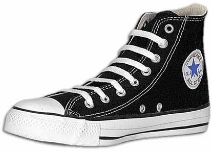
 The audience for my product will be teenage to mid adults aged around 14 to 25/30. It will be for both male and female emos, scene kids, goths and indie kids. This is because of the style of music my magazine is. It will be mostly metal, rock and punk. This ties in stereotypically with my audience. This audience would mainly buy clothes like converse ‘all stars’; colourful hoodies; skinny jeans of all colours and black t-shirts with things like dragons and metal bands on. They would shop in stores like ‘The Rock Collection,’ ‘Blue Banana,’ ‘Dead Good Clothing’ and other general stores like ‘New Look’ and ‘Debenhams.’ Stereotypically, this audience don’t like to be part of the crowd, they like to from their own crowd and stand out from the rest. This is why I think that bright colours are what they like to wear most. Another thing with my audience is that they normally like piercings but this doesn’t effect the whole ‘group,’ some like to have the odd one and some go to the extreme and have more than average all over their body. For example; neck, wrist, bridge of nose, inside of nose and around the mouth and lips. Many examples of this group and other social groups can be found at UK Tribes. Although people would associate females more with this fashion than males, there are actually more males than what most people think.


UK Tribes: Emo's
What kind of media institution might distribute your media product and why?
I think that IPC media would distribute my magazine because they are a big corporation and have a wide range of magazines already in circulation. This might have a few advantages but a disadvantage is that because it is so big the price for distributing my magazine maybe higher than other companies. I also think that IPC would be good for my magazine because NME is an IPC magazine and that has 10,000’s of readers and my magazine has a bigger chance of getting read. With this magazine already in circulation, it makes my magazine a parrot publishing magazine. My magazine does offer tuition and has its own store for musically associated people so that is a sort of a niche. IPC might also want to include some of their own advertisements and include my magazine in some of the more popular and wider read magazines. My magazine is similar to NME in the sense that it is a music magazine but so it ‘Rocksound’ and ‘Kerrang!’ not forgetting ‘Rolling Stone’ and ‘Q.’ All of these magazines produce a rival market so my magazine has to attract the correct audience if readers will want to read it. I think that you would be able to buy my product from main magazine retailers such as W H Smiths other supermarkets such as ASDA, Morrisons and TESCO. Although my target audience is substantially adequate for distribution of this magazine I believe that in some cases they won't be rich enough because of spending on mobile phones, hair dye, accessories such as; bracelets, tongue bars, other forms of piercings, clothes and footwear. Distribution may be a problem to start with as well because without enough money behind it, my magazine won't be able to distribute in supermarkets such as ASDA and TESCO but only in minor stores like LONDIS and possibly W H Smith.

Tuesday, 23 February 2010


How does your media product represent particular social groups?
For this photo I looked to see how rock/metal bands would stand and pose. With this in mind I selected the only female in my picture to stand slightly forward than the rest of the band as she is the lead vocalist. This also shows the non-stereotypical way that I presented my female. She’s is the main singer in the band but many people would associate the majority of my target audience (goths, emos..ect) to be females. I think this is because of the eyeliner and hair that this audience have. Well, this is not true; there are more males that are in this 'category' than what most people think. The eyeliner has no effect on the boys that do wear it and some males will have any colour in their hair! The angle of this photo is low so the band can look down and be dominant over the reader. All the members of the band are expressionless and looking directly into the camera. This gives the effect of addressing the audience directly and as the social group would behave in an aggressive way this image also shows aggressiveness. For my image on the left I chose lighting at either side of me where I was standing and also a white background as I didn't want any distractions or attractions behind the band. The band members' hair for this shot was rather simple and normal. Again, this is the type of hair that my audience would have. They would possibly have black hair and/or bright colours such as red, electric blue and other colours. You can also see the clothes they are both wearing are similar. 

My target social group was male and female indie scenesters and also emos and goths. This is because of the genre of music my magazine includes. For example, metal and hard rock. I think my magazine represents social groups conservatively by reinforcing stereotypes such as emos and goths.
Thursday, 28 January 2010


Tuesday, 12 January 2010

Music Magazine Inital Ideas
The working title of my magazine is going to be 'BreAkdoWn' This is because when I thought of a name for my magazine I wanted something that stood out. My target audience are going to be both men and women in the age range teens to mid twenties (13 - 25). I am going to aim my magazine at emos, scene kids, skaters, goths and moshers. I'm choosing this audience because it is the kind of music I am into and is also popular with many people. It also covers a wide range instead of focusing on one stereotype.

I'm going to pitch my magazine at around £2.00. This is because I want the intended audience to buy it and not think it too expensive. There are magazines that come out weekly and some that come out monthly. My magazine will come out fortnightly. This is in between the two most popular release dates. I think that this will draw some readers because there are not too many all at once, it gives you time to read the current issue and its not the complete opposite, your not reading it over and over again waiting for the next issue to come out.
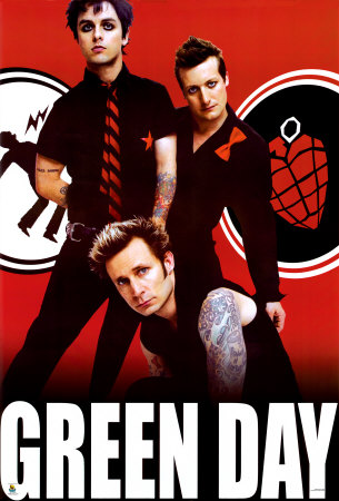 In my magazine I am going to include; Gig news, New Albums, Band/Album Reviews, Interviews, Photos, Posters, Competitions plus more. This is because I need to attract readers and make them like my magazine, I have to include things they like, this is a music magazine after all.
 For the layout of my magazine I am going to keep simple to an extent. I will have the masthead at the top of the page and then a strap above this. I will have cover lines at each side advertising what is in the magazine. I will have a main photo for the front cover but also more photos layered on top. I will have eye catching text, fonts and colours to grab the readers' attention.
Thursday, 17 December 2009


Monday, 14 December 2009


Tuesday, 20 October 2009
Planning My College Magazine
To start this task I did a questionnaire to see what my friends liked in a collage magazine and then compared and added them with the rest of my classes to get a greater and more accurate set of results to use in creating my cover and contents. From the Questionnaire I found that with 36 votes, most people would prefer the magazine to come out monthly, therefore I decided to make my magazine monthly. I also found out that the top four things that students would like to read about in the magazine are; gigs and gig news, movie reviews and releases, gaming tips and reviews and local collage news and events. For this reason I have decided to include these things in my magazine and as they are what the students want, some are advertised on the front. To my surprise I also found out that students want equal amounts of writing and pictures rather than more pictures or vies-versa. Students came out on top to be on the front of the magazine itself. Despite wanting an equal amount of pictures and writing, the magazine also needs to be not to serious and not too jokey, it needs to be somewhere in the middle. I still needed some more ideas for my magazine so I analysed an existing magazine cover which you can see below labelled ‘SOUP.’ I found that the masthead needs to catch the readers attention yet fit in with the style of the magazine. One thing I did see one ‘soup’ that I didn’t like a lot was how simple the magazine looked. So using this I decided to make my magazine look more complex.
Subscribe to:
Posts (Atom)